

Experiment new techniques is probably the best way to evolute and to find your own style. I deeply enjoy sharing some of my design / art experiences thru tutorials with you guys. So for this week I going to teach a little experiment I did with wall painting, painting in huge scales was always interesting to me, since the logic of the effects you want to achieve just change radically from just using your finger to using your two arms, something way more physical than just using a computer.
This was really interesting to showcase, since I won't only show you only "how to do" , but also what you should avoid to do and the mistakes I've commited. Trying to innovate in our tutorials, this one will be more about learning thru videos rather than images, since I've noted that on the last "manual techniques" tutorial, people really enjoyed to watch the timelapse on the end. As every artwork, perfection can never be reached, so free yourself from rules, dogmas and other things and let's start this tutorial as just an exercise and fun. came out.
So, what are we going to learn today?
Today we're going to learn basically just to do a geometric pattern, following what some artist have being doing lately, a style more geometric, minimalistic and interesting. I've been seen this type of wall painting / graffiti a lot lately, this genre don't focus on making signatures or 3D letters, but on abstract and geometric shapes that give a illusion of depth sometimes. Some of my main influences to do this projet were Graphic Surgery, Nawer and the famous MWM Graphics. I've posted some examples of this artists bellow:
Graphic Surgery


Nawer


MWM Graphics


What stuff I'll need in order to do it?
This is pretty basic stuff, since you probably may already have those tools at home:
1- Duct Tape
or other type of a strong sticky tape, I used normal masking tape, but honestly I wouldn't recommend, since I've got some problems using it, as you're going to see later.
2- Razor or Scissor
depending of the tape you're going to use this will be necessary.
3- Spray Cans
well, the colors don't have necessarily to be black and white color, but you should try to use really contrasted colors in order to get the depth we want to.
4- Posca pen or whatever you wanna use for painting it
this is up to you, after you finished the painting to adjust the corner and other things, however don't try to make all perfect or it will definetely lose it's grunge look.
5- Gloves
some of you maybe dislike wearing gloves, but honestly the time you will spend trying to wash your hands to get the ink off it, worth using it.
6- Painting Mask
it don't have be to a world war gas mask or something really fancy, it can be even just a bandana strapped on the face. Use one, don't try to painting without, or you may get really dizzy with the smell.

Step 1
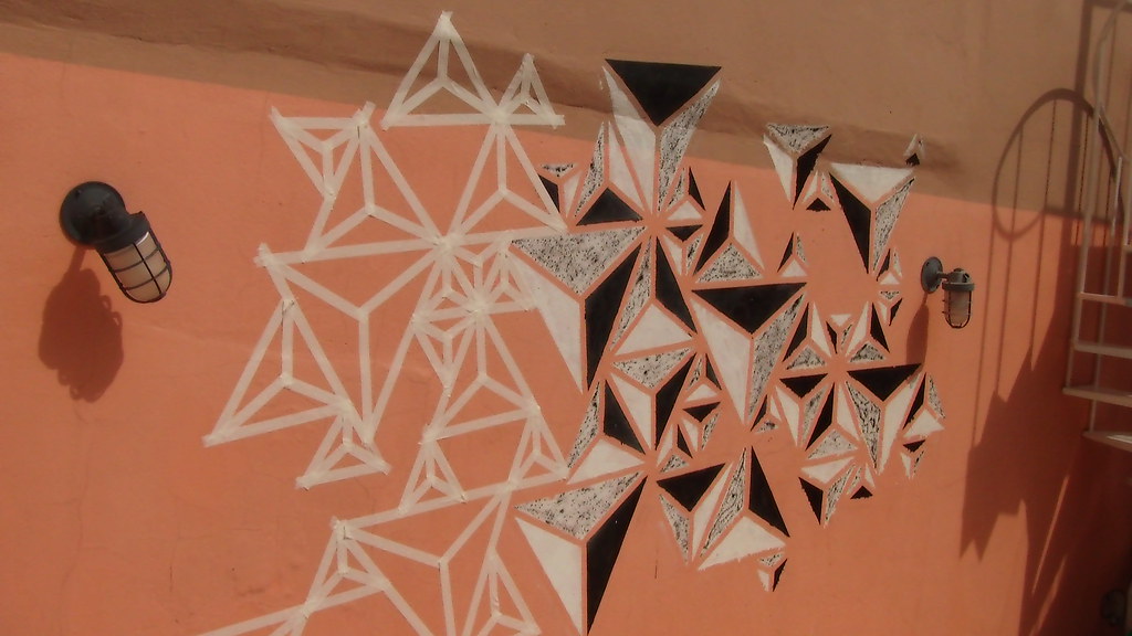
This may sound obvious, but you should first make a project before start doing it, just to get at leat a idea of how it would came out. So first of all go get the measures of the wall you're going to paint. I did on Adobe Illustrator a preview of how it would came out, using the measures in scale. But, first I had to find a interesting pattern, so I though about a triangle shape, since it's a better shape to fit a space in any direction..

So how could I give more depth to it? While trying to use some 3D softwares other day I came with a triangle with just 3 colors: white, gray and black. Looking at it gave me the idea to making it 2D, since the three colors placed on each side give the impression of light on it. So I divided the triangle in three sections ad painted with this colors.

So then I had to plan how I would place the triangles, they shouldn't be with the same size nor direction or this would came out really boring. So I distribute then along the space trying have a pattern "unpattern".

Then I just wanted to had a preview of how would be the masking tape placed, and the painting on it.


I took off the strokes to have a better preview, and then just scrumbled the colors of the prisms so they don't get in the same direction.


It didn't came out exactly as the original project and this is actually really good, as you're going to see further.

Step 2 ( Masking )
Some people asked me why I didn't used stencils, well I think I could have used 3 sizes of stencils. However, when you're trying to improvise it way more easy and interesting to use tape, because you can have a better preview of the painting rather than just using stencils. But If you want to do this way, that's ok, but be sure you can improvise with it easily.

Always print a copy of the project and take it with you, you really cannot do it without at least a reference, so I suggest to print a sample.

The video below pretty simplify this step.
Prisms - part 1 from Marcos Torres on Vimeo.
Step 3 ( Dividing in sections )
I must admit that this step is a bit boring, but necessary to be well execute, dividing in equal sections may look easy, but is not, unfortunately. The video bellow exemplifies it.
Prisms - Part 2 from Marcos Torres on Vimeo.
Step 4 ( Painting )
Before you start painting you should really care about these two tips:
1) Use newspaper to cover the ground, it is likely that you will spend one more coat of paint and will drip a lot. So just get a old newspaper, distribute bellow the area and stick it on the ground (or use weights), but don't let it start flying, or it will be a mess.

2) Use gloves, I know I said this before, but unless you want to spent some days with your hands dirty (as I did on the first time I painted), I suggest you to wear some.

After setting all this stuff let's start to paint. I decided to first paint the black sides then the white and grey sides. As you're going to see on the next step, paint two sides of white and one side of black, because we need a white background to do the shading with the black spray. A good thing is put more than a coat of paint, so the first time you paint it, try to spray it more softly and you will have less problems with dripping. The video says it all.
Prisms - Part 3 from Marcos Torres on Vimeo.
Step 5 ( Shading )
Some may say that I should have bought a grey spray can rather than trying to shade with black spray, that's right, but the thing is to create it with less resources as possible, since not everyone can spent a lot of money on material. To be honest I learned this type of shading thru an accident: while working in other graffiti work I noticed that if I hold the cap softly just little tiny drops would came out of it. And as we know, looking at this piece from a certain distance will gives the impression to be grey. However, the main problem with it is that it drips a lot of ink from the can, so be sure that you have already covered the ground with some newspaper. The next video show a close up of the painting and shading.
How to spray the prisms from Marcos Torres on Vimeo.
And just a wider look at how to do it.
Prisms - Part 4 from Marcos Torres on Vimeo.

Final Result
This is not actually the end of this project, I've repeated the whole process at least three times till now, but more days of work will come, since I want to make this all over the wall. The thing is: don't try to do it perfect, I know most of people see geometric shapes as something well defined, but in my opinion I though that the mistakes I've commited turned it into something more organic. The best advice I could give to you guys is to have fun, I actually love doing it and will try more wall painting after this experience, so get your hands dirty, work hard, but above all, enjoy this time.
Prisms from Marcos Torres on Vimeo.

Mistakes you should avoid
Since I know that the "Abduzeedoes" are very worried with details and finalization, here i posted some tips of thing s you should try to avoid (or not). As I said before, I had some problems with the masking tape and paint, this is quite normal, and since there's not actually rights and wrongs on doing it, I just going to show somethings that bothered me a bit, nothing seriously. I think we shouldn't fear committing mistakes and so I showing the ones I've commited to make the things easier to you guys, hope you understand it.
Cracks on the wall
This not actually your fault if happens, but try take a close a look at the wall you're doing it or when taking off the tapes, parts of the wall may came out too.

Blurring
This what happens when you use the wrong tape, the ink may get between it and will mess it a bit, but in the other hand, it gives a grunge look to it, so it's up to you to get it all correctly or not.

Dripping
This is pretty normal to anyone who already ainted with a spray can, the best way to avoid is to find correct distance between the wall and your had when spraying.

Tiny sizes
When you're masking it, try to don't make tiny formats, since the may get really unrecognizable later.

So that's it guys, hope you had fun and learned a bit with this quick tip, see you on the next tutorial ;)

Generated by BlogIt
BlogIt - Auto Blogging Software for YOU!


