Showing posts with label Tips. Show all posts

Tuesday, 5 July 2011

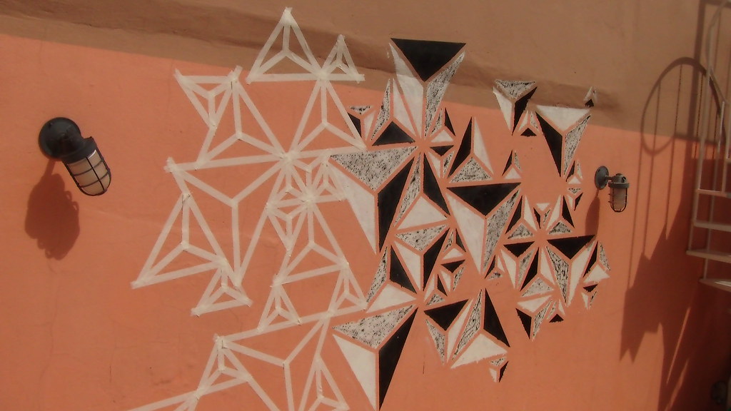
Quick Tips: Create Geometric Wall Painting Pattern


Experiment new techniques is probably the best way to evolute and to find your own style. I deeply enjoy sharing some of my design / art experiences thru tutorials with you guys. So for this week I going to teach a little experiment I did with wall painting, painting in huge scales was always interesting to me, since the logic of the effects you want to achieve just change radically from just using your finger to using your two arms, something way more physical than just using a computer.


This was really interesting to showcase, since I won't only show you only "how to do" , but also what you should avoid to do and the mistakes I've commited. Trying to innovate in our tutorials, this one will be more about learning thru videos rather than images, since I've noted that on the last "manual techniques" tutorial, people really enjoyed to watch the timelapse on the end. As every artwork, perfection can never be reached, so free yourself from rules, dogmas and other things and let's start this tutorial as just an exercise and fun. came out.


So, what are we going to learn today?


Today we're going to learn basically just to do a geometric pattern, following what some artist have being doing lately, a style more geometric, minimalistic and interesting. I've been seen this type of wall painting / graffiti a lot lately, this genre don't focus on making signatures or 3D letters, but on abstract and geometric shapes that give a illusion of depth sometimes. Some of my main influences to do this projet were Graphic Surgery, Nawer and the famous MWM Graphics. I've posted some examples of this artists bellow:


Graphic Surgery


Nawer


MWM Graphics


What stuff I'll need in order to do it?


This is pretty basic stuff, since you probably may already have those tools at home:


1- Duct Tape


or other type of a strong sticky tape, I used normal masking tape, but honestly I wouldn't recommend, since I've got some problems using it, as you're going to see later.


2- Razor or Scissor


depending of the tape you're going to use this will be necessary.


3- Spray Cans


well, the colors don't have necessarily to be black and white color, but you should try to use really contrasted colors in order to get the depth we want to.


4- Posca pen or whatever you wanna use for painting it


this is up to you, after you finished the painting to adjust the corner and other things, however don't try to make all perfect or it will definetely lose it's grunge look.


5- Gloves


some of you maybe dislike wearing gloves, but honestly the time you will spend trying to wash your hands to get the ink off it, worth using it.


6- Painting Mask


it don't have be to a world war gas mask or something really fancy, it can be even just a bandana strapped on the face. Use one, don't try to painting without, or you may get really dizzy with the smell.


Step 1


This may sound obvious, but you should first make a project before start doing it, just to get at leat a idea of how it would came out. So first of all go get the measures of the wall you're going to paint. I did on Adobe Illustrator a preview of how it would came out, using the measures in scale. But, first I had to find a interesting pattern, so I though about a triangle shape, since it's a better shape to fit a space in any direction..


So how could I give more depth to it? While trying to use some 3D softwares other day I came with a triangle with just 3 colors: white, gray and black. Looking at it gave me the idea to making it 2D, since the three colors placed on each side give the impression of light on it. So I divided the triangle in three sections ad painted with this colors.


So then I had to plan how I would place the triangles, they shouldn't be with the same size nor direction or this would came out really boring. So I distribute then along the space trying have a pattern "unpattern".


Then I just wanted to had a preview of how would be the masking tape placed, and the painting on it.


I took off the strokes to have a better preview, and then just scrumbled the colors of the prisms so they don't get in the same direction.


It didn't came out exactly as the original project and this is actually really good, as you're going to see further.


Step 2 ( Masking )


Some people asked me why I didn't used stencils, well I think I could have used 3 sizes of stencils. However, when you're trying to improvise it way more easy and interesting to use tape, because you can have a better preview of the painting rather than just using stencils. But If you want to do this way, that's ok, but be sure you can improvise with it easily.


Always print a copy of the project and take it with you, you really cannot do it without at least a reference, so I suggest to print a sample.


The video below pretty simplify this step.


Prisms - part 1 from Marcos Torres on Vimeo.


Step 3 ( Dividing in sections )


I must admit that this step is a bit boring, but necessary to be well execute, dividing in equal sections may look easy, but is not, unfortunately. The video bellow exemplifies it.


Prisms - Part 2 from Marcos Torres on Vimeo.


Step 4 ( Painting )


Before you start painting you should really care about these two tips:


1) Use newspaper to cover the ground, it is likely that you will spend one more coat of paint and will drip a lot. So just get a old newspaper, distribute bellow the area and stick it on the ground (or use weights), but don't let it start flying, or it will be a mess.


2) Use gloves, I know I said this before, but unless you want to spent some days with your hands dirty (as I did on the first time I painted), I suggest you to wear some.


After setting all this stuff let's start to paint. I decided to first paint the black sides then the white and grey sides. As you're going to see on the next step, paint two sides of white and one side of black, because we need a white background to do the shading with the black spray. A good thing is put more than a coat of paint, so the first time you paint it, try to spray it more softly and you will have less problems with dripping. The video says it all.


Prisms - Part 3 from Marcos Torres on Vimeo.


Step 5 ( Shading )


Some may say that I should have bought a grey spray can rather than trying to shade with black spray, that's right, but the thing is to create it with less resources as possible, since not everyone can spent a lot of money on material. To be honest I learned this type of shading thru an accident: while working in other graffiti work I noticed that if I hold the cap softly just little tiny drops would came out of it. And as we know, looking at this piece from a certain distance will gives the impression to be grey. However, the main problem with it is that it drips a lot of ink from the can, so be sure that you have already covered the ground with some newspaper. The next video show a close up of the painting and shading.


How to spray the prisms from Marcos Torres on Vimeo.


And just a wider look at how to do it.


Prisms - Part 4 from Marcos Torres on Vimeo.


Final Result


This is not actually the end of this project, I've repeated the whole process at least three times till now, but more days of work will come, since I want to make this all over the wall. The thing is: don't try to do it perfect, I know most of people see geometric shapes as something well defined, but in my opinion I though that the mistakes I've commited turned it into something more organic. The best advice I could give to you guys is to have fun, I actually love doing it and will try more wall painting after this experience, so get your hands dirty, work hard, but above all, enjoy this time.


Prisms from Marcos Torres on Vimeo.


Mistakes you should avoid


Since I know that the "Abduzeedoes" are very worried with details and finalization, here i posted some tips of thing s you should try to avoid (or not). As I said before, I had some problems with the masking tape and paint, this is quite normal, and since there's not actually rights and wrongs on doing it, I just going to show somethings that bothered me a bit, nothing seriously. I think we shouldn't fear committing mistakes and so I showing the ones I've commited to make the things easier to you guys, hope you understand it.


Cracks on the wall


This not actually your fault if happens, but try take a close a look at the wall you're doing it or when taking off the tapes, parts of the wall may came out too.


Blurring


This what happens when you use the wrong tape, the ink may get between it and will mess it a bit, but in the other hand, it gives a grunge look to it, so it's up to you to get it all correctly or not.


Dripping


This is pretty normal to anyone who already ainted with a spray can, the best way to avoid is to find correct distance between the wall and your had when spraying.


Tiny sizes


When you're masking it, try to don't make tiny formats, since the may get really unrecognizable later.


So that's it guys, hope you had fun and learned a bit with this quick tip, see you on the next tutorial ;)


About the author

My name is Marcos Torres, I'm Graphic Artist from Porto Alegre, Brasil. You can get to know more about me by acessing my Website ( http://marcostorres.info/ ) or by following me on Twitter: @marcos333.


Sponsored Links:


Abduzeedo Inspiration Guide for Designers at Amazon

Generated by BlogIt

BlogIt - Auto Blogging Software for YOU!

BlogIt - autoblogging software for YOU

BlogIt - autoblogging software for YOU

Tips on Creating Fluffy Characters


One of the best things about clients is that they're always surprising us with some random and misterious pitch works. One of my last briefings was to create a fluffy character, but since I always made illustrations more realistic, this was quite a challenge for me. As some of you may have thought, I also tought that creating a fluffy character would be as easy as drawing an apple, but I was wrong and on this tutorial I will explain the reasons why.


So, you may be asking yourself, why is not that simple to create a fluffy character? Well, character design is actually a specific field, so as every specific field on art/design area, it has some rules and guidelines. So, before we start our tutorial, let's first understand why should we learn more about it: character design is a very requested service in areas like advertisement, visual identity, branding design, comics and children's products (books, packages, websites, etc). Basically, it's an awesome thing to know how to do, even if you don't work as a illustrator or artist. Ok, so lets see some examples of illustrators that work in this area in order to get used with some aspects:


Melanie Matthews


Tamara Henderson


Jeremy Ville


Bruno Mota


Ok, now that we are inspired, let's do it!


The tips I will describe are all based on my observations and experiences while trying to reach good results on character design, but I'm open for any tips and tricks you may know, so please comment and share your knowledge with us. For the next steps I selected some famous fluffy characters to prove my theories.


1) Remarkable and Simple Silhouette


First of of all, let's try a bit of trivia, can you recognize the characters bellow?


Did you recognize most of them? If not it is probably because you wasn't born on the 80's / 90's hehehe just kidding. But if you really did recognize them is because my first tip is correct: you should always try to create a remarkable silhoutte for your character, it must be so remarkable that you can recognize it even years without seen it. The fact is that some of theses characters are used as brands, take a look at Hello Kitty for example, her head shape is used as logo, you can see it in every material produced. So my tip is to use simple silhouttes, because more realistic and detailed silhouttes can be mistaken with other characters or maybe even not understood. Also remeber that it should be easy as a kid can remember how to draw it.


If you want to know more about theses characters, please click the following links: Kirby, Pikachu, Hello Kitty, Pucca, Toad.


2) Few and Light colors


One of the best ways to discover the predominant colors of a photo is by pixelating it, you will get the main colors as pixels. So, I decided to apply this technique in those characters in order to show that they use a really limited color pallete, but why? As you need to create an identification with the public, you should not only try to use predominant colors, but also use few and never change them, in any situation. For example, Pikachu has yellow as his predominant color and black and red as secondary colors, even if we changed these colors, we would still identify these pixels as Pikachu, because yellow is a intrinsec color to this character.


Also, as you want to get something more childlike, you should use a light color pallete and light gradients. High contrasts are not recommended (Pucca is a definetely a exception in this case), because they can only be achieved with solid colors, what doesn't fit into something more soft.


3) Simple Trace


This may sound obvious, but do you remember when you were a kid and had those coloring books with outlined characters? Well, some of us started to learn how to draw by those books... because of the drawings we used to color, they were really easy to draw. As you can see bellow, these are characters really easy to draw , made with simple trace, not using any hashing or pen/brush marks, most of them have a vector look indeed.


So, try to simplify things, it must be understandable seen from meters away, uniform lines should be the way to it. The part that actually you should work harder on them are the eyes, try always to create them simple, but catchy eyes, use glows or light gradients, make them notable.


4) Round and Disproportional Shapes


Disproportion is a clear characteristic of child illustration, but why? In my point of view, kids rather see disproportional illustrations because they are more related to fictional worlds. Also, realistic illustrations brings us too much close to reality, so there are more details, more colors, more shapes and different traces. When you're a kid this maybe too much to process/understand and also it may look a bit agressive in some cases. Quick tip: The bigger the eyes, the more child look you will give to you character, the same thing with the head, so try to apply disproportion on this kind of way.


Ok, but what about the rounded shapes? As some of you have already study in design disciplines such as Gestalt, the circular shapes refer to security, stability, feminism . So, the fact is that you should avoid squared or triangular shapes on these kind of character. You may say Pikachu have a lightining tail that don't follow this rule, but in this case that's not a problem since his tail is in that shape only to remind us of his powers as the rest of his body is round.


5) Few and Notable Details


Ok, as I said before we should try to make it simple, but with touch of personality. I think you got to insert a few and precise details in your character, not just clothes, but something really unique on him. Bellow are all the characters analised one by one:


Kirby may look a lot simple but if there are some details remarkable on her are the eyes and mouth really close to each other and also big pink shoes.


Pikachu is a more elaborate character with his remarkable lightning shaped tail and his red cheeks.


Hello Kitty is another character that appeals to simplicity into it's best, but using some classic details as the ornament on her head, that may change, but is always on the same side.


Pucca got a really memorable face due to her niponic eyes and her hair design.


Finally Toad remind us a mushroom mixed with a baby, his little coat it's what gives a final touch to it.


So...Let's try!


Now let's try to pratice all these tips on a whole new character. After some skecthes I developed this bunny look a like character trying always to stick with the five tips.


Bunny - Time lapse - vector process from Marcos Torres on Vimeo.


Step 1 (Remarkable and Simple Silhouette)


After the skecthing and creation of the character I had to see if his silhouette was not confuse or similar to other character already created.


Step 2 (Few and Light colors)


I decided to use 6 colors on this character, being the light blue the predominant color, and green and light yellow the secondary colors.


Step 3 (Simple Trace)


As I did it all in vector, I tried to make it the flat as I could.


Step4 (Round and Disproportional Shapes)


Above you can see only the outlines of the character, I tried the most to use only round shapes and make big eyes and head, a really disproportional body that would evoke something more childlike.


Step 5 (Few and Notable Details)


So the main characteristics of this character are his little teeth and his big eyes, that's what I think is most memorable by looking at him.


Final Considerations


Well I know this was kind of a more theoretical tutorial, after doing some practical tutorials I decided to try this kind. I did this because I think sometimes just learning how to draw something exactly won't help you to draw better. It can help, but it won't answer questions as "why to do it?" , "when to use it?" and "how should I do it?". I hope you understand the whole idea of this tutorial and have a nice time trying to create your own characters.


About the author

My name is Marcos Torres, I'm Graphic Artist from Porto Alegre, Brasil. You can get to know more about me by acessing my Website ( http://marcostorres.info/ ) or by following me on Twitter: @marcos333.


Sponsored Links:


Abduzeedo Inspiration Guide for Designers at Amazon

Generated by BlogIt

BlogIt - Auto Blogging Software for YOU!
BlogIt - autoblogging software for YOU

BlogIt - autoblogging software for YOU