Showing posts with label Typography. Show all posts

Tuesday, 5 July 2011

Yummy Cookies Typography in Photoshop


I woke up this morning thinking about an idea for a tutorial, then I remembered that last week I saw a really nice text effect that the characters were made of bread if I am not making any mistake. So I thought it would be really nice to create a text made of cookies just using Photoshop.


So in this tutorial I will show you how to create a really nice text effect playing with cookies texture and layer styles. The technique is super simple and the whole process won't take more than 30 minutes.


Step 1


Open Photoshop and create a new document. I am using 2560x1440 pixels for the size. After that double click on the background layer to make it editable, then go to Layer>Layer Style>Gradient Overlay. Use #fdebc2 and #f7efe0 for the colors, Radial for the Style and make sure the center is lighter than the edges.


Yummy Cookies Typography in Photoshop


Step 2


Add the text you want, I typed abdz using Cooper Std Black for the font because it is rounded and bold enough to make them look as they are made of cookies.


Yummy Cookies Typography in Photoshop


Step 3


Now let's use some real cookies texture. I used a stock photo from Shutterstock, you can find the one I used at http://www.shutterstock.com/pic-74918797/stock-photo-three-peanut-butter.... Cover the text with cookies and group them so they will be in a folder.


Yummy Cookies Typography in Photoshop


Step 4


Create a marquee selection of the text by clicking holding Command (Mac)/Control (PC) on the thumbnail of the layer. Then select the folder that the textures are inside and go to Layer>Layer Mask>Reveal Selection.


Yummy Cookies Typography in Photoshop


Step 5


Select the mask layer and go to Filter>Brush Strokes>Sprayed Strokes. Use the values below for reference.


Yummy Cookies Typography in Photoshop


Step 6


Still with the mask selected, go to Filter>Blur>Gaussian Blur. Use 2 pixels for the Radius. Tip: This value might vary depending on the font you are using and the font size as well.


Yummy Cookies Typography in Photoshop


Step 7


Still with the layer mask selected, go to Image>Adjustments>Levels. Change the values to 100, 1.00 and 150. The idea here is to fix the blurry edges by removing the greys. So we first made the edges irregular but it was too much, then with the blur we softened that but they got blurry, so with the Levels we make then again sharp and clear.


Yummy Cookies Typography in Photoshop


Step 8


Here is the final result of the masking process. The cool thing about masking a folder is that you still have freedom to play with the layers inside it.


Yummy Cookies Typography in Photoshop


Step 9


Create a marquee selection of the layer mask that has all the irregular edges and then add a new layer. Fill this layer with any color and then go to Layer>Layer Style>Blending Options. Change the Fill Opacity to 0%.


Yummy Cookies Typography in Photoshop


Step 10


Select Inner Shadow and use the values below.


Yummy Cookies Typography in Photoshop


Step 11


Select Inner Glow and once again use the values below.


Yummy Cookies Typography in Photoshop


Step 12


At last but not least select Drop Shadow. Use Color Burn for the Blend Mode and use the image below for reference.


Yummy Cookies Typography in Photoshop


Step 13


This is the final result with the layer with layer styles on top of the folder with the cookie textures.


Yummy Cookies Typography in Photoshop


Step 14


Disable the Drop Shadow and then select the layer with layer styles and the folder with textures. Then duplicate them and merge them onto new layer. Change the Blend Mode of this new layer to Overlay then.


Yummy Cookies Typography in Photoshop


Step 15


As you can see it was pretty easy to create the text with cookie texture, it was all about playing with masks and layer styles.


Yummy Cookies Typography in Photoshop


Conclusion


You can add more text and also rotate some characters in order to make them look more realistic. Also notice that the layer style values will change for smaller texts like the one below in which I typed the alphabet. The cool thing about this technique is that you can apply to all sorts of textures. Now it's all about playing :)


Yummy Cookies Typography in Photoshop
Click on the image for full preview


Download the Photoshop File


Download the Photoshop file used for this tutorial


About the author

Abduzeedo is a blog about design. There are all sorts of articles for those who want to look for inspiration. Also you will find very useful tutorials for the most used applications out there, with a special selection of Photoshop Tutorials and Illustrator Tutorials. You can get in follow us via Twitter at @abduzeedo


Sponsored Links:


Abduzeedo Inspiration Guide for Designers at Amazon

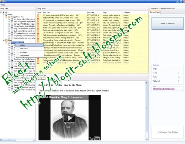
Generated by BlogIt

BlogIt - Auto Blogging Software for YOU!

BlogIt - autoblogging software for YOU

BlogIt - autoblogging software for YOU

Vintage 3D Typography in Photoshop with Repoussé


Sunday is the day to play with Photoshop and try some new ideas. As usual I went through some books and Web sites to find some inspiration. I am still addicted to the Handy Book of Artistic Printing, it's a must have book for some old style print references. I got some ideas and also found this amazing image from Alex Beltechi on Dribbble called Twisting in the Wind. Then I new the effect I wanted to know how to create in Photoshop.


So in this tutorial I will show you how to create a super cool and very easy effect using Photohosp and the Repoussé tool. The whole process is quite simple, it's less than 10 steps and won't take you more than 30 minutes.


Step 1


Open Photoshop and create a new document. I am using 2560x1680 with 300 DPI (very important) with black background. With the Horizontal Type Tool (T) add a text. I am using for the font Edwardian Script ITC. Notice that I sort of connect the words "the" with "book" with "of" and with "Abduzeedo". After that merge the texts into a new layer then create a marquee selection of the text area by clicking on the thumbnail of the layer holding Command(MAC)/Control(PC).


Vintage 3D Typography in Photoshop with Repoussé


Step 2


Go to 3D>Repoussé>Current Selection. The Repoussé dialog box will open then change the Depth to .7 and the Lights to Day Lights. Also you might have to select some areas to change the type to Hole for the Internal Constraints.


Vintage 3D Typography in Photoshop with Repoussé


Step 3


This is the result after the 3D filter. In order to render the final image you must select the Scene in the 3D dialag box and change the Quality to Ray Traced Final.


Vintage 3D Typography in Photoshop with Repoussé


Step 4


Merge all layers into one including the black background, then go to Image>Adjustments>Levels. Change the Input Levels to 65, 1.35 and 128.


Vintage 3D Typography in Photoshop with Repoussé


Step 5


Go to Image>Mode>Greyscale. After that go to Image>Mode>Bitmap. Change the Output to 600 pixels/inch and the Method to Halftone Screen.


Vintage 3D Typography in Photoshop with Repoussé


Step 6


For the Halftone Screen, change the Frequency to 70 lines/inch, the Angle to 45 degrees and the Shape to Line.


Vintage 3D Typography in Photoshop with Repoussé


Step 7


Go to Image>Adjustments>Levels. Change the Inputs to 17, 1 and 206. Also change the Output Levels to 42 and 255.


Vintage 3D Typography in Photoshop with Repoussé


Step 8


Time to add some texture. Import some old paper texture, the one I am using is courtesy from Shutterstock and you can find it at http://www.shutterstock.com/pic-43075990/stock-photo-the-old-shabby-pape.... After that go to Image>Adjustments>Leveles. Change the Input to 142, 1.00 and 255.


Vintage 3D Typography in Photoshop with Repoussé


Conclusion


Change the texture layer to Multiply and the effect is pretty much done. You can also save the image in the step 5 and reuse it here adding on top of the layer with halftone at 50% Opacity to make the effect a bit more smooth. As you can see the Bitmap mode is perfect to create some old style print effect, especially now that when vintage and this sort of effect is quite trendy.


Vintage 3D Typography in Photoshop with Repoussé
Click on the image for full preview.


Download the Photoshop Tutorial


Click here to download the Photoshop file used for this Tutorial


About the author

Abduzeedo is a blog about design. There are all sorts of articles for those who want to look for inspiration. Also you will find very useful tutorials for the most used applications out there, with a special selection of Photoshop Tutorials and Illustrator Tutorials. You can get in follow us via Twitter at @abduzeedo


Sponsored Links:


Abduzeedo Inspiration Guide for Designers at Amazon

Generated by BlogIt

BlogIt - Auto Blogging Software for YOU!

BlogIt - autoblogging software for YOU

BlogIt - autoblogging software for YOU

Monday, 4 July 2011

A Brief Introduction into Graffiti Typography


As some of you, I always noticed the graffiti on the streets of my town, and I used to do that since I was a kid. I always wanted to understand what those letters meant. Part of not understanding is due to the fact that I didn't know much about graffiti and its culture, but as soon as I got in touch with some graffiti artists I started to understand how they do their work and why.


So, my goal with this tutorial is not just to showcase and explain a bit of graffiti typography, but to help to break the prejudice that a lot of people, even in the creative area, got with this kind of artwork. I know that, even If you don't like graffiti at all, you will not look at it on the same way after this post.


Before we begin, let me inform that our main goal is to teach new techniques, tips and share our knowledge. We're not sponsoring vandalism or any type of crime, we just want to explain and teach how to do this kind of typography. We deeply trust in our readers, so what you're going to do with this knowledge is really up to you. Do the right thing.


Letters styles on Graffiti


There's many classifications for the letters you see on the street, although most of they may look the same, they're all produce by different techniques and got levels of difficulty. To simplify things, I decided to put them on three categories: Tag, Throw Up and Wildstyle. Before I can show you some tricks on creating them, I gotta teach more about them.


Tag / Pichação


Tag is the most basic form of graffiti, is basically the graffiti artist signature. There's even a classification for the one who just do tags: tagger. A tagger is considered, in most of the cases, a inferior graffiti artist who tag he's street name everywhere, but lacks in drawing skills and/or creativity. Most of the street artists start their career as a tagger, then start developing a style from that. Tags can be done in such a enormous range of styles because they can be done with a large range of tools, from spray cans to markers or even clay. Let me show you some classic and stylish tags:


Os Gemeos
Os Gemeos's Tag


Risk
Risk's Tag


Amarzz's tag
Amarzz's tag


In Brasil we got a really unique type of tag, we call it "Pichação". Pichaçhão or Pixo is quite different of the tags developed in north america and europe, mostly because of the media that it was originaly produced: the paint roller. By the time the first graffitis started to appear, spray cans were very expensive in my country and so it was way better to use latex paint mixed with water, in order to last longer and do more tags. The taggers tried to develop an unique typography, influenced by CD and book covers, helped to create what some call the "Pixo Reto", a squared and thin tag, only seem on Brasil. Here are a couple of "Pixo Reto" examples:


Foto por Marco Gomes
Marco Gomes


Photo by Fórum Latino Americano de Fotografia


Most of the tags / pichação are illegal, except the ones used in legal walls or at exibitions. The interesting thing is to observe the styles of caligraphy that can be developed, Evan Roth even made a study about it, take a look at the video bellow:


Graffiti Taxonomy: Paris, 2009 from Evan Roth on Vimeo.


Throw Up / Bomb / Scrub


Most of you may reconize Throw Up as a bubble letters type, indeed most of the writers who practice this type of letter use round shapes, however there are many variations of it, let's see some.


Rikardo NSK
Ricardo NKS's Throw Up


Os Gemeos
Os Gemeos's Throw Up


Rime
Rime


A throw up is called Scrub when the lines inside the letter body are not complete filled, like it was done on a hurry. In fact, most of the throw ups are illegal, that's part explain why they are not so elaborated as a wildstyle piece. Take a look at the one done by Revok:


Revok
Revok


So, I hope you understood a bit about throw ups, here's a good gallery with you want to see some samples.


Wildstyle / Burner


In my point of view, the wildstyle pieces are the ones that make Graffiti so memorable, because they are big scale pieces with 2 hours to even a month of work. There's no rules or a pattern when comes to wildstyle, but there's a lot of techniques that are commonly applied when you're learning how to use spray paint. 3D, Shadowning, Glows, Gradients are used by most writers while trying to develop a unique and memorable style. So, let's see some of this pieces:


Pose
Pose


Toniolo by Sei Lá
Toniolo by Sei Lá


Holie NSK
Holie NSK


Dilk
Dilk


Nychos
Nychos


Rime
Rime


Here's a good glossary of terms used in the graffiti area, you should read in order to understand some slangs and terms used to describe and categorize pieces.


Tips on creating your own graffiti type


Well guys, I will try to explain to you how to do a simple process of a wildstyle piece. Of course, is really up to you to define what effects and calligraphy you're going to use, there is so many ways to do it, so this will be just a quick introduction. I know most of you probably never touched on a spray can, so what are we going to do is to try to simulate the dinamics of a street situation, using a spray can in Adobe Photoshop. However, you should try do it on real life, that's the only way to understand and learn such aspects as spray hardness, types of cap, gradients and other tricks. But I hope the following exercise can help you on some way.


Sketch


Ok, so the first thing we should do is to know exactly what we will write. Most graffiti artists write their own nick/street name, for this sample I'm going to write just "Abduct". The Sketch is basically a simple structure of the future typography, you should from now on use only the brush tool (the shortcut is the letter "B") on this exercise, no eraser or ctrl + z / command + z, you will understand it soon. Set a color for the background, try using white on, somehow it seems to be easier to create on it. Now, define 4 colors to use, think it as spray cans, on the beginning is way better and cheaper to use just a few colors. Always use the same color of the background, because this will be used as a eraser in real life.


Let's try to draw the letters using a close tracking, use a 10 px brush, If you have a tablet this will be way easier, but If not you sould try it with mouse, it's not that harder. Use the color you want to use for the letter fill to do the sketch, why? Because in a real situation you would save ink by doing it. You should try some more round or really squared shapes, as I'm doing here. Remember: don't use the eraser, If you fell it's not straight or round enough, do it over the other trace, forget about ctrl + z.


Fill


Now let's fill the letter with the color we used for the sketch, don't be afraid, you will remember what part is each letter. Let's add a second color fill inside them


This may look really horrible by this point, but we're going to fix it on the next step. Add a really thin black stroke, just to identify each letter.


Cutting Lines


Cutting lines are probably the most used and basic technique on graffiti, why? This is actually the way to reach sharp and squared shapes, also is by doing this, you're going to make layers over in order to fix some mistakes. Let's see a simple example, I created this square with blue and red inside. I want to create two red triangles, so this is actually what I should do:


Do you get it? You're actually using the brush as a eraser to make shapes straight and hide mistakes. Although this may take a lot of time to master, you gotta try, because the results are solid. So now you're going to adjust the second fill using cutting lines.


Stroke


You may be asking yourselves: "Why should we do the strokes after the fill?" Well, pretty simple, because of the dripping. If you start by doing the stroke, chances are you're going to redo it many time because of the fill that may drip or blur over it. To adjust the stroke, do the same procedure here, cutting lines and patience.


Glows and Lights


Most graffiti artist really enjoy adding some glow and lights to the pieces, it looks really cool indeed. Let me show you just a simple tip: make an "X" with a white color, then use a blurry brush and here it go. This is quite simple, but as you keep evolving you can learn a lot about lightning and shadows.


Final Considerations


I hope you learned a lot today, not just the types of graffiti, but also learned a bit how to do this kind of typography. There're no rules or guidelines when it comes to graffiti, the most important thing it's to try and push things to another level. That's it folks, I will try to make another posts about the subject, explaining other techniques and stuff, work hard and have fun.


About the author

My name is Marcos Torres, I'm Graphic Artist from Porto Alegre, Brasil. You can get to know more about me by acessing my Website ( http://marcostorres.info/ ) or by following me on Twitter: @marcos333.


Sponsored Links:


Abduzeedo Inspiration Guide for Designers at Amazon

Generated by BlogIt

BlogIt - Auto Blogging Software for YOU!

BlogIt - autoblogging software for YOU

BlogIt - autoblogging software for YOU