Today I'm going to show a case study of a personal illustration I did recently. Having the will to experiment some new techniques, I found out that I should try more to include my drawings on my artworks, as artists like Sara Blake, Ian Macarthur, Gabz and others already do.
Mixing manual and digital medias can be really handy, since at the same time that you got a unique trace on the original drawing, you can also erase the errors you did on the computer and enhance the details. Also, I thought about a tip that James White once said, about making a fan poster of a artist that you like. So I decided to do a series about it and the one I'm gonna show you is the second one poster, a tribute to the electronic musician Mux Mool, non commercial purposes, of course. So in this case study I will show you my creative process, from the first sketch all the way until the end.
Sketching
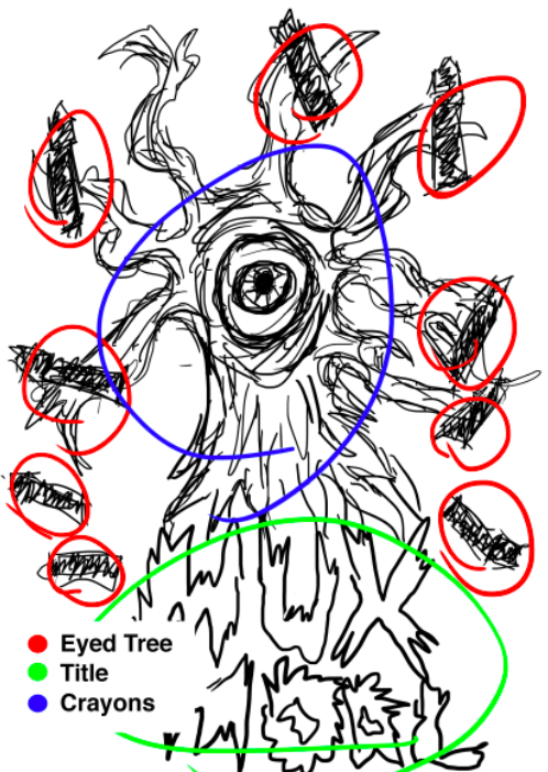
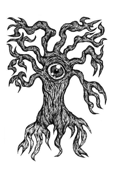
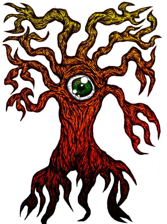
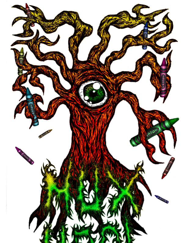
Ok, I must admit, my project sketches are horrible, I use it just to get a preview of what I'm going to do, but isn't that what a Sketch is all about? Don't worry guys, I put some subtitles so you could understand it better hehe. My initial concept was to make a joke with the name of the music, "No black crayon", using a carachter with many crayons on his hands, but I suddenly though that it would be more rad with I drew a more remarkable carachter and so I came out with this eyed old and dry tree. I also thought to use a Black Metal inspired typography for the name.
Outlines
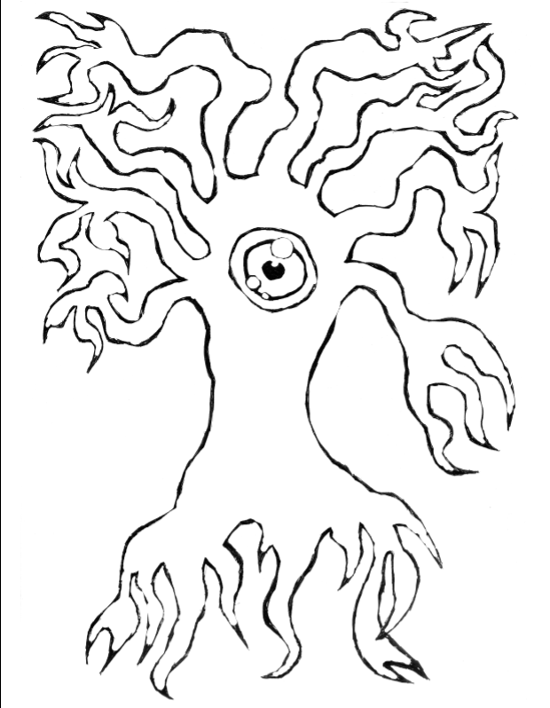
I know this may sound obvious, but even if I'm doing a drawing in Photoshop, I always begin with the outlines and shapes and after I do the fill and shading. I'm just saying this because some people tend to think you should do the three steps at once. What may happen is that one will lost the proportion of things, so you better do first the outline before making the fill.
Shading - iris
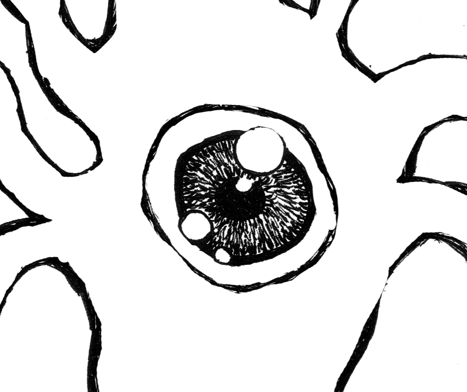
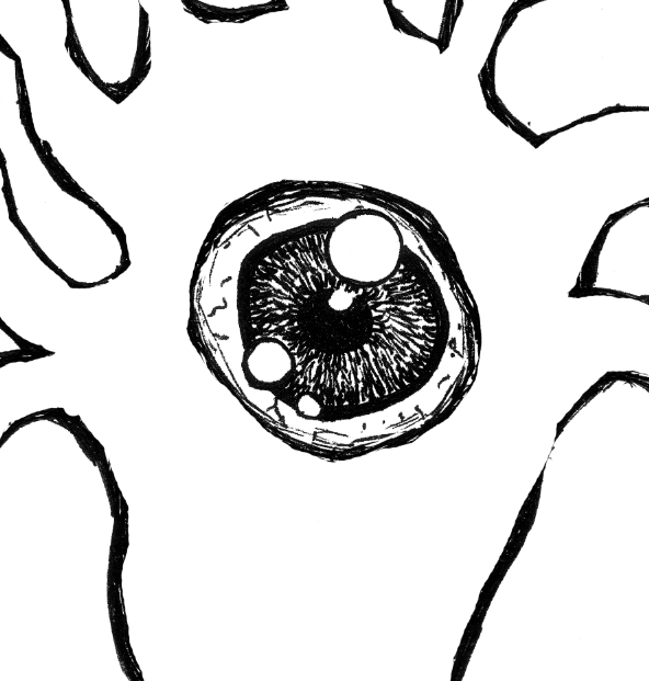
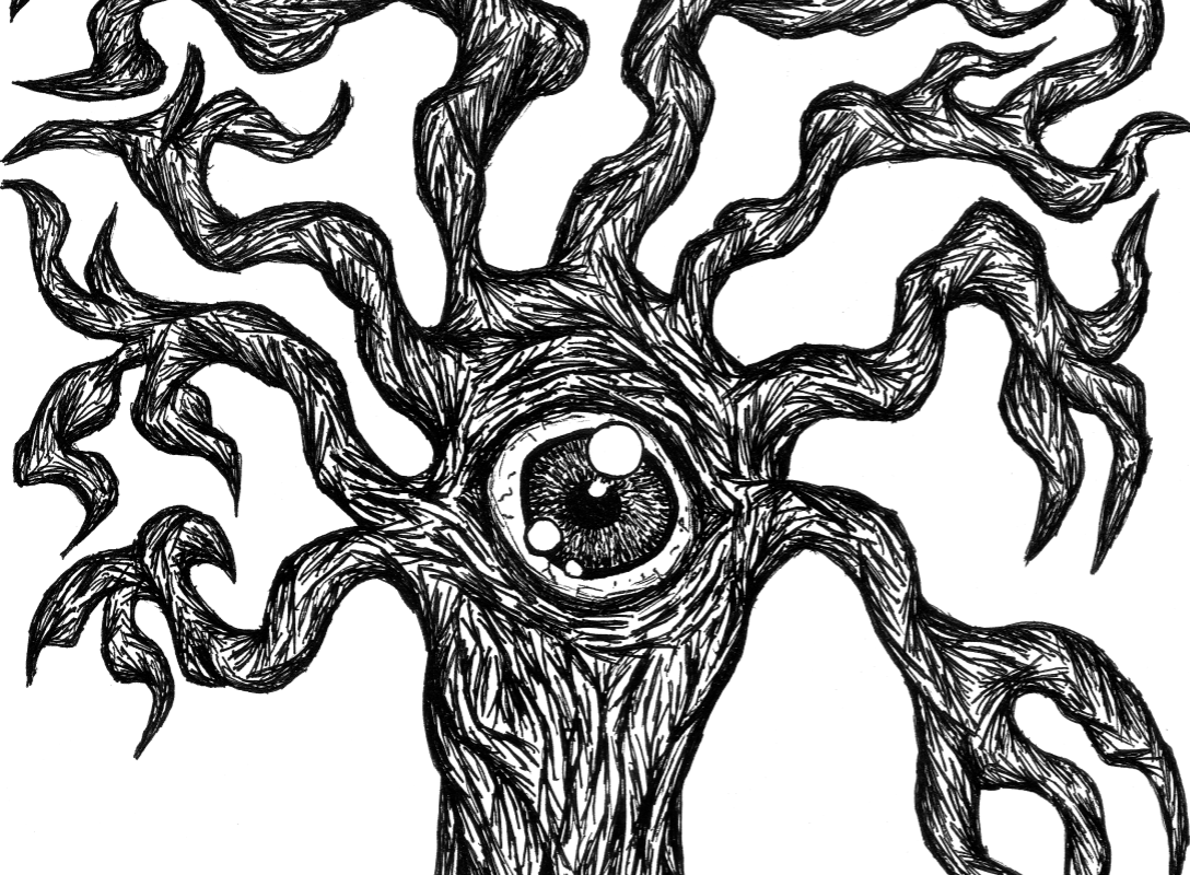
Isn't that hard to make and iris, you just got to know how to fill it with dash in a circular direction, also add some reflects.
Shading - body
Achieving this type of wood texture it's about practicing and observation, later I will enhance the wrinkles on PS to give some depth.
Adding color
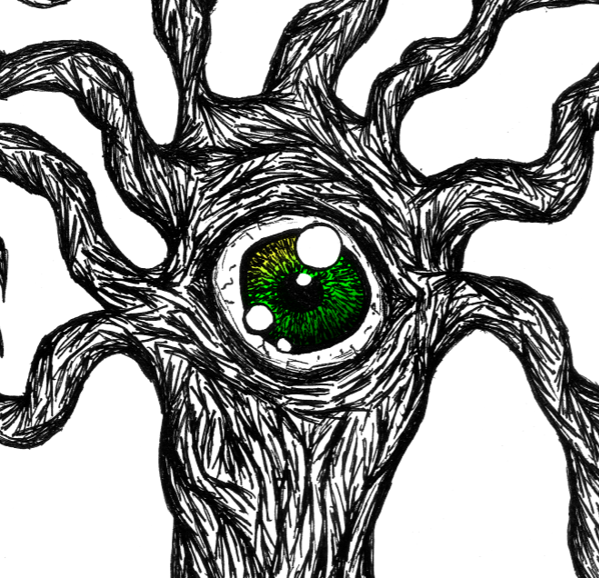
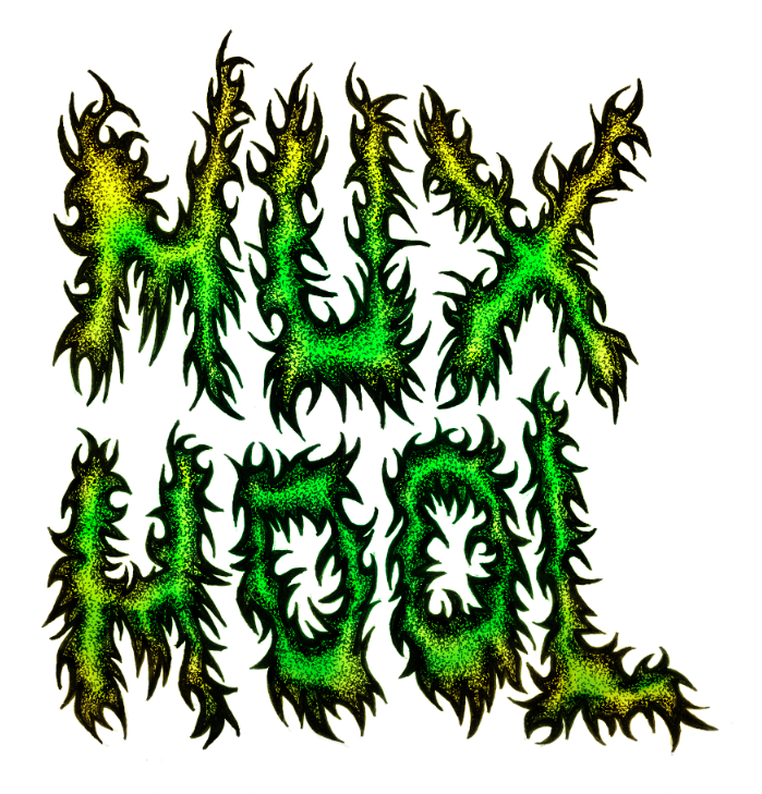
I've always found always better to add color on photoshop, but this is about my way to do things, of course, everyone has it preferences, I like because you can commit mistakes and experiment a lot of things. After I finished the drawing, I scanned it with 1200 dpi, it's a good resolution to get a lot of details and print it in a large scale, but you still can get great results using only 300 dpi scanned pics. Back to the coloring process, I basically make a layer above the drawing layer, I use some soft brushes to make the gradients and blends and use Multiply to apply it to the drawing.
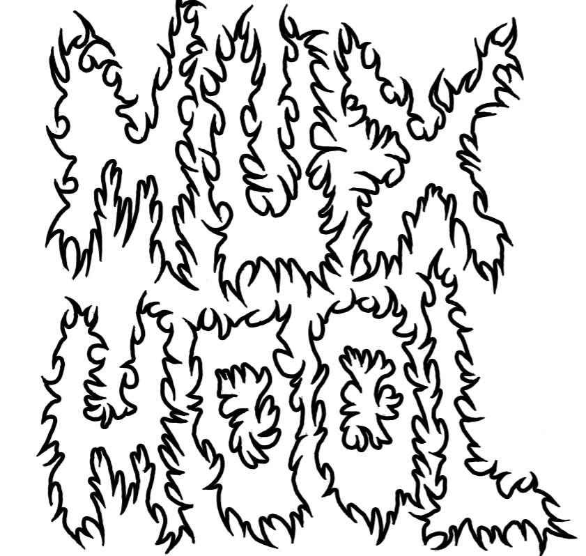
Outline
Again, first i did the outline of this typography, I really wanted to give a strong lookto it, so I got inspired in some Black Metal Band logos.
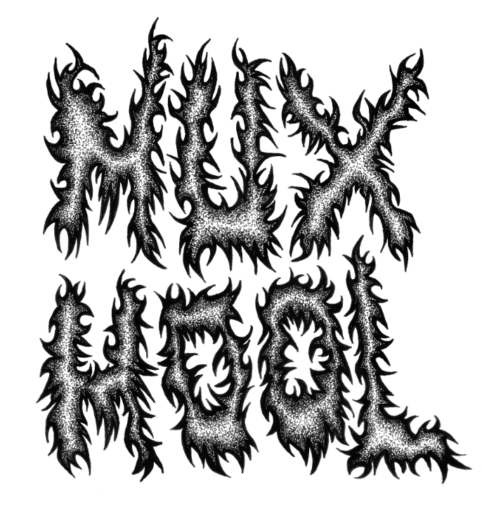
Dot Sading
Dot shading isn't a new technique, but it's quite awesome and I must admit I'm quite addict to it lately. Basically, you make the shades and create depth by the distance of the dots, yep, this takes some good time to achive, the video bellow exemplifies this step.
Dot Shading from Marcos Torres on Vimeo.
Adding color
Outline
Dot Shading
Adding color and gradients
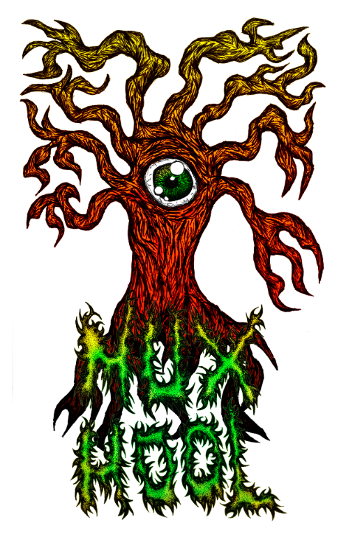
Final Result
Well, there were some few experimentations till the final result, but the focus of this case study was about the drawing process, If don't got a good drawing, Photoshop won't save you probably. Some may say I should have used the white background instead of the black, but the idea was to make impossible to have a black crayon in there, If there was one, you wouldn't see it heheh just kidding. Hope you enjoyed and learned some quick tips.

Generated by BlogIt
BlogIt - Auto Blogging Software for YOU!



No comments:
Post a Comment